QR code colours: what works and what doesn't
Updated on
A QR code doesn't have to be black on white. It does have to meet one non-negotiable condition: the modules, the little squares that make up the pattern, must be clearly darker than the background.
Almost every colour-related scanning problem comes down to that single rule. And the most expensive mistake, the one that forces a reprint, is inverting it.
Why an inverted code fails
An inverted code has light modules on a dark background: white on black, for instance. Aesthetically it can look great, which is why it turns up regularly in brand design.
The problem is that the format's specification assumes dark modules on a light background, and many readers look for exactly that pattern. Some modern cameras cope with an inverted code, others don't, and there's no way to know in advance which one the person scanning will have. A code that works on your phone but not on half your customers' is, in practice, a broken code.
That's why this tool only offers dark-on-light combinations in its presets. If you're set on inverting, test it on several different phones first, and accept that you'll lose a share of the scans.
How much contrast is needed
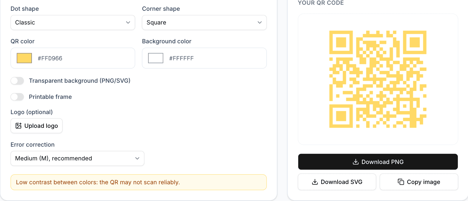
The difference between the code colour and the background is measured as a contrast ratio. For code reading you want a comfortable ratio, considerably higher than what's accepted for text, because the camera works in lighting conditions you don't control: shade, glare, yellowed paper, ink that bled.
This tool warns you when the chosen combination falls below the recommended threshold. That warning isn't decorative: it marks the point where the code starts failing in real conditions even though it looks perfect on screen.
One surprising detail: contrast isn't the same as difference in hue. An intense red and an intense green look very different and yet have similar lightness, so to a camera they can be nearly the same grey. What matters is the light-to-dark difference, not the colour one.
Combinations that work and that don't
Saturated darks on white or on a very soft light work well: navy, bottle green, burgundy, dark purple, very dark grey. All keep lightness low and read just like black.
Mid-tone colours on white fail, such as pale blue, orange or yellow: they look strong but they're light, and the camera can't cleanly separate module from background. Combinations of two mid tones fail too, like brown on olive, as does anything light on a dark background.
Gradients are their own case. A gentle one between two dark tones of the same family usually works. One running from a dark colour to a light one breaks the code in the zone where contrast is lost, and the trouble is that zone might land on a critical pattern.
Transparent backgrounds and other printing traps
A code exported with a transparent background has no background of its own: it takes on whatever it's printed over. If that ends up being a mid or dark colour, the contrast disappears and the code stops reading even though the file was fine.
Transparency is useful when you know for certain there's a light, flat background underneath. If the code goes over a photo, a texture, or a colour that isn't decided yet, exporting with a white background is safer.
And the classic printing mistake, which isn't about colour but looks like it: trimming the code's white margin so it fits smaller. That margin is part of the format, and without it many readers can't find the code at all. If you're short on space, shrink the code, not its margin.